The visual identity for Kizomba Design Museum – a travelling platform dedicated to preserving and presenting the history of kizomba, launched during the 35th São Paulo Biennial – tries to envision something that despite feeling evocative could also feel contemporary and modern: in level with the spaces its founders want kizomba culture to occupy.


Kizomba Design Museum is a travelling platform dedicated to preserving and presenting the history of kizomba, its music, its dance, its culture, and what it has meant to the communities across the Portuguese-speaking African countries and their diaspora who carry it. Its first iteration took place during the 35th São Paulo Biennial, in September 2023.
The visual identity acts as a validating, dignifying gesture. It intends to align the project with design museums and other official cultural institutions. It does this without the visual and operative constraints those institutions carry.
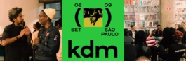
Departing from two pillars, it makes vibrant use of colour and employs the visual presence of punctuation (brackets and parentheses) as a structural and conceptual device. Traditionally, punctuation like this adds information that has not been said but needs to be for context, enclosing details and adding meaning.
This gesture reinforces the word 'museum' in the project's name, which is a statement rather than a description. Images and additional information are enclosed in brackets and parentheses throughout the project's materials, including posters, flags and brochures, providing context and supplementary information. It is a symbolic gesture that highlights the need to extend what is memorialised to include the more ephemeral and frequently neglected parts of culture.
The wordmark stays quiet by comparison: a compressed lowercase kdm, extending to KIZOMBA DESIGN MUSEUM in full only where the project needs to identify itself formally. Everywhere else, colour is bold and unapologetic. Photography runs through a hard duotone process, posterised into blocks of colour, its reading oscillating between pattern and photograph.
The identity extended into a website built to contextualise the project and provide access to the programme, hosting guest-curated playlists and essays, alongside print materials for the São Paulo edition, and event graphics including flags and space-marking pieces for the activation.
Client: Kizomba Design Museum (founders: Kalaf Epalanga, Nástio Mosquito)
Category: Visual Identity, Webdesign, Editorial & Print, Event Graphics
Year: 2023
Format: Logo & brand system, website, posters, event programme, playlist artwork, press materials, event graphics (flags, space-marking pieces)
Project assistant: Rita Mota


Kizomba Design Museum
Kizomba Design Museum is a travelling platform dedicated to preserving and presenting the history of kizomba, its music, its dance, its culture, and what it has meant to the communities across the Portuguese-speaking African countries and their diaspora who carry it. Its first iteration took place during the 35th São Paulo Biennial, in September 2023.
The visual identity acts as an extension of that validating, dignifying gesture, elevating the project to the level of design museums and other official cultural institutions, without the constraints those institutions carry.
It departs from two pillars: a vibrant use of colour, and the visual presence of punctuation (brackets, parentheses) as a structural and conceptual device.
Traditionally, punctuation like this adds what hasn't been said but needs to be, for context, enclosing information, adding meaning. The gesture reinforces the word “museum” in the project’s name, which stands as a claim, not a description.
Images and auxiliary information sit inside brackets and parentheses throughout – across posters, flags, brochures – giving context, adding information, making a comment. A symbolic gesture for the need to extend what gets memorialised to the more ephemeral, frequently neglected parts of culture.
The wordmark stays quiet by comparison: a compressed lowercase kdm, extending to KIZOMBA DESIGN MUSEUM in full only where the project needs to identify itself formally. Everywhere else, colour is bold and unapologetic. Photography runs through a hard duotone process, posterised into blocks of colour, its reading oscillating between pattern and photograph.
The identity extended into a website built to contextualise the project and provide access to the programme, hosting guest-curated playlists and essays, alongside print materials for the São Paulo edition, and event graphics including flags and space-marking pieces for the activation.
Client: Kizomba Design Museum (founders: Kalaf Epalanga, Nástio Mosquito)
Category: Visual Identity, Webdesign, Editorial & Print, Event Graphics
Year: 2023
Format: Logo & brand system, website, posters, event programme, playlist artwork, press materials, event graphics (flags, space-marking pieces)
Project assistant: Rita Mota
Eva Gonçalves
Rua do Mato Grosso 11a
1170-234 Lisboa
Portugal
Lausitzer Str. 11
10999 Berlin
Germany
For project enquiries,
commissions or collaborations,
please get in touch:
studio@evagoncalves.com
+49 (0) 176 568 081 61
Instagram ↗
LinkedIn ↗
Behance ↗
© Eva Gonçalves 2026
Eva Gonçalves
Rua do Mato Grosso 11a
1170-234 Lisboa
Portugal
Lausitzer Str. 11
10999 Berlin
Germany
For project enquiries,
commissions or collaborations,
please get in touch:
studio@evagoncalves.com
+49 (0) 176 568 081 61
© Eva Gonçalves Studio 2026